


Churchward Type
Please allow 7 working days to process before shipping
Profits donated to WIRES
White Short Sleeve
100% Combed Ring Spun Cotton
Joseph Churchward was born in 1932 in Apia, on Samoa's Upolu Island. Raised by his paternal grandparents his blood-line is a cocktail of Samoan, Tongan, Chinese, Scottish and English ancestry. At age 13 Churchward was sent to New Zealand by his grandparents for further education. Travelling by boat from Samoa, he strongly recalls arriving in Wellington, where he went to live with his aunt and uncle in the Wellington suburb of Kilbirnie. Young Joseph began to study art at Wellington Technical College, and it was here that he demonstrated a natural affinity for hand lettering – a passion that can be traced back to his childhood in Samoa, when he would draw letters in the sand.

Joseph Churchward’s affinity developed into a career. At Just 18, after a lightning-quick interview, he dived into an apprenticeship as a commercial artist at the Wellington advertising firm, Charles Haines. This was his base for the next 12 years. At that time, before Letraset and digital type, Churchward would spend his days drawing headline lettering by hand. His keen enthusiasm for the work meant he had plenty to do. He recalls: “I worked overtime completing the hand lettering and I became an expert. The other employees were all jealous! My real training came from practice at the hand lettering jobs at Charles Haines.” He became considerably proficient at creating letterforms by hand. Through hours or repetitive drawing he came eventually, quite naturally, to consider his own letterforms. He forged his own alphabets by reinterpreting the familiar forms of his daily work and endowing them with influences from his culture and surroundings. The work during these early days laid the foundation for a method and style that is characteristic of his process today.

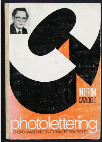
Near the end of his employment at Charles Haines, Churchward had begun to accept freelance commissions. In 1962 he had so much work that he took leave and founded his own company, Churchward’s Lettering Service, in a second-floor studio in central Wellington. In 1969, after steadily building his business up over the years, he had a major breakthrough. He published his first unique typeface, Churchward 69, for one of his largest clients at the time — the Woolworths supermarket chain. Though he didn't know it then, the typeface heralded his future direction.

Working seven days a week and now aided by a small number of staff, Churchward (the proverbial workaholic) continued to grow his business. He was soon able to acquire his first photo lettering and typesetting machines from the Berthold company. During this acquisition a sales representative from A.M. Satterthwaite & Co. (Berthold’s New Zealand agent) happened to notice some of Churchward's alphabet designs in his studio. The representative encouraged him to submit a few to head office in Germany, in the anticipation of a publishing contract. A handful of these designs were accepted and it was the first time a New Zealander had licensed original alphabet designs to an international company.

One particular alphabet family from this early period illustrates his idiosyncratic approach, where many ‘versions’ of a single design are created. Churchward Design 70 (1970), a seemingly Bauhaus-influenced typeface (through Churchward denies any outside influences on his work), has a family of no less than 72 variants. Where the Bauhaus would have probably settled with one version, all lower case, Churchward Design 70 was the starting point for a varied agglomeration, suggesting infinite possibilities and amalgamations derived from a single skeleton. It includes bolds, ultra-bolds, italics, metallics, hairlines, outlines, multi-lines, shadows (morning/evening), shadow-outlines, chisels, ‘mystic’ shadows, ‘sparkly’, no-end, and on the list continues.

By 1971 Churchward had 22 fonts licensed to Berthold and six were in production. His innate response was to become the first company to licence and distribute its own fonts in New Zealand. However, paradoxically, Churchward described a growing frustration with trying to implement these licenses locally. Unless they were a ‘hit from overseas' it seemed nobody would take a gamble and use them. Despite his international success, his feeling of frustration was manifest in an emblematic way in 1973 when Churchward was turned down for a Queen Elizabeth II Arts Council Travelling Scholarship on the grounds that “lettering [was] not art”. For cultural growth and geographic proximity to other type designers overseas this opportunity could have proved invaluable for Churchward.

During the 80s, Churchward also happened be designing some quite curious headline alphabets that allude to a spirit and style of the times. They include the architectonic Churchward Roundsquare, the carved-out but stoic Churchward Display and the deceptively inchoate Churchward Crossbred. Churchward not only focused on headline alphabets, for which he had become best known, he also designed two extensive alphabet families more suited to text setting: Churchward Sans and Churchward Roman. Both demonstrate his well-rounded approach to letter craft.

The 1980s economic boom had bolstered New Zealand’s thriving advertising industry and this had allowed Churchward International Typefaces Limited (CIT, as it was known) to employ a staff of eighteen. There were big budgets and plenty of work. The strictly service-orientated approach at Churchward's required long hours and weekends to meet deadlines, but staff were well rewarded for their efforts. Five of Churchward’s children worked for the company at various times: Lorina in the darkroom, Marcia and Marianna as typesetters, Paul as courier, and his eldest son, Joe Churchward, became increasingly involved in the day-to-day running of the business. This allowed Joseph Sr. the privilege to focus on the thing that he loved best — designing typefaces.

Then, in 1987, the stock market crashed. In the ensuing fallout, companies slashed advertising budgets and almost immediately the volume of work for CIT was halved. In June 1988, after nineteen years in business, Churchward International Typefaces Limited fell into receivership. But it wasn't just the crash that was responsible for the demise. Churchward’s early decision to ignore then-new computer technology, which quickly became an industry standard, made it impossible for him to catch up. He recalls being one of the first people in New Zealand to see an Apple Macintosh computer and was impressed by what it could do. However, when he discovered Walt Disney was a major shareholder in the Apple company he dismissed it as "nothing but a toy". He acknowledges ruefully, "Six months later everyone had one, and I was finished".

In the month following CIT's collapse Joseph made the difficult decision to return to Samoa, where he hoped to resurrect his business as a freelance advertising designer. A space set aside on his business card from the time reads: GOVERNMENT WORK MOST WELCOME. This is indicative of his preferred type of commission on the island. Life was quite trying in Samoa but Churchward still managed to get by with the familiar work of newspaper, supermarket and shop advertisements. After eight years of persistent effort, Churchward's business hopes in Samoa were not what he had expected. In 1995 he returned to his family In Wellington— where he lived the remainder of his life.
His situations may have changed, but his approach remains markedly consistent. HAND LETTERING IS SUPERIOR is proudly printed in capitals on his current business card. It’s a kind of personal axiom -- and a maxim that Illustrates his unrelenting work ethic and output. His only concession to digital technology remains a trusty photocopier with which he scales, tests and duplicates his designs.

Churchward’s design process usually begins with a few letters, after which he seems obsessively compelled to find the balance of letters to complete the alphabet. Added to this urge is the creation of different weights, italics and variations (approximately 150-300 working hours per alphabet). His letters, digits and punctuation marks are first carefully drawn in pencil onto A3-sized sheets. Ruled horizontal lines (a capitals height of 70mm, another 25mm underneath and the baseline a further 45mm below) act as the guides with which Churchward constructs all of his alphabets. The pencilled forms are then inked up, worked back or added to, until they fit together as a whole. He remains convinced that drawing letters by hand produces a result of the highest quality. It wasn't until later that Churchward has faced the inevitable need for current technology in order to publish and distribute his designs.

The digitizing of his type began when, unbeknown to Churchward, Churchward Brush & Churchward Brush Italic were digitized by the German foundry URW++. This first digitization possibly happened by way of an inheritance of some rejectamenta from an old Berthold library. A relative of Churchward happened to discover their existence and tried to get in contact with URW++. The ensuing correspondence eventuated in a license agreement between Churchward and URM++ for the two alphabets. A letter from this time also proposes the digitization of more of his designs to “[Create] a library of exclusive Churchward fonts”. At the same time, through an acquaintance, Churchward was introduced to the US-based foundry Chank Types, with whom he eventually entered a publishing deal that would finally see the release of a volume of digital versions. Unfortunately, what began as a new lease of life for his designs became a small typographic soap opera. Unresolved contractual Issues, unrealistic projected sales figures and a possibly dubious approach to Churchward’s intellectual property rights were the main themes of its ‘pilot episode’. The relationship with Chank ended prematurely just weeks before the release of the first series of fonts.

Cautious but undeterred, Churchward made the decision to contact MyFonts.com to inquire whether it provided a digitization service. Through John Collins of of MyFonts, Steve Zafrana of BluHead Studios (USA) answered the call and is currently responsible for digitizing Churchward’s library. Churchward and Zafrana had an odd dialogue that was particular to the information age. They had never met or spoken with each other, but communicated via Marianna’s email and the postal service. It was a relatively slow process, but it proved fruitful: every month or two another Churchward typeface appeared on MyFonts site for purchase. On April 26th 2013, Joseph Churchward passed away at the age of 80. Even though he has moved on, his passion for his craft can be seen and felt through his many typefaces and logos.